Regional comparison mapped; logger and forecast analyses next
01 / The spatial decisions
Make the comparison mean something.
01
Start with the coast, not the table.
I noticed that the first fishnet did not cover the study area. I worked through a longitude correction in a guided ArcGIS workflow, then checked coastal coverage before continuing. Each satellite cell needed to stay tied to a real location.
02
Compare habitat area, not just cell counts.
A cell containing a sliver of mapped habitat should not carry the same habitat weight as one containing much more. The GIS workflow intersects historical reef/hardbottom polygons with the grid, then sums hectares by heat-stress class.
03
Keep missing heat data visible.
Eight of the 51 habitat-containing cells have no valid DHW. I keep their mapped area separate from the low-exposure class so the comparison does not turn missing information into a reassuring result.
02 / The saved regional comparison
Two years. The same coast.
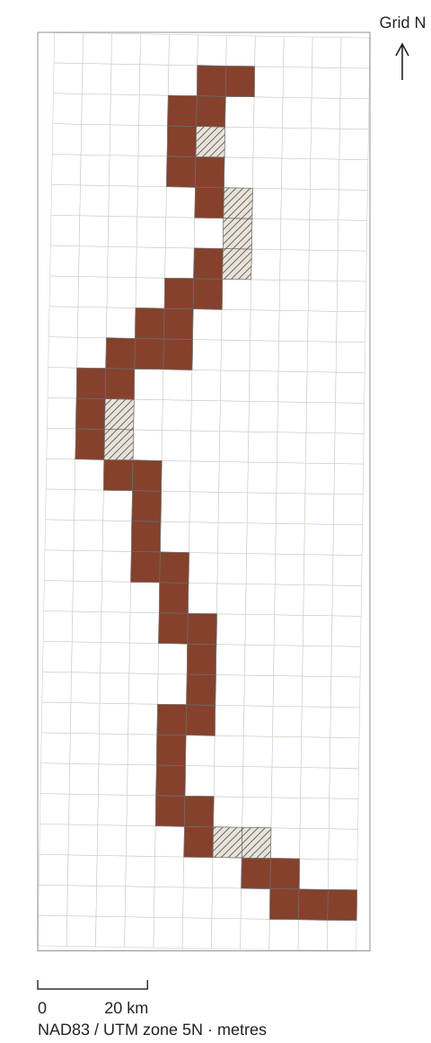
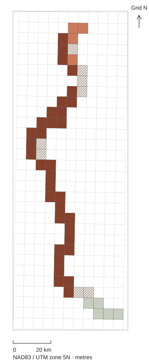
Both maps use the same cell geometry, extent and class scale. Filled cells contain historical mapped reef/hardbottom; the remaining grid is outline-only context.
Annual maximum DHW (°C-weeks)
Below 4
4 to below 8
8 or above
No valid DHW
2015
43 habitat cells in the ≥8 classAssessed habitat cells share the highest class. Coarse satellite cells are not individual reef measurements.
2019
34 habitat cells in the ≥8 classThe same coast has a mix of assessed classes. Coarse satellite cells are not individual reef measurements.
Data-only cartography redrawn from the saved ArcGIS layers. NAD83 / UTM zone 5N; arrows indicate grid north. No basemap or inferred coastline. These cell maps show annual peak class, not heat-stress duration.
Share of all mapped reef/hardbottom areaAnnual maximum DHW class · same 5,702.29 ha denominator in each year
2015
8 or above83.0%
No valid DHW17.0%
2019
Below 48.3%
4 to below 811.4%
8 or above63.3%
No valid DHW17.0%
17.0% has no valid DHW in either year. It stays in the denominator and has its own hatched class—it is not treated as low exposure.
Read the values and what the map can tell us
DHW (Degree Heating Weeks) accumulates qualifying heat stress over a rolling 12-week period. These classes use each cell’s annual maximum. They describe satellite heat exposure, not observed coral bleaching, mortality or recovery.
The grid has 330 cells; 51 contain mapped reef/hardbottom. The habitat layer was published in 2007 from 2004–06 imagery, so this is historical mapped habitat—not present coral cover. Cell colours classify heat stress; the bars weight those classes by intersected habitat area, not by coloured map area.
All mapped habitat: 5,702.29 ha. Assessed habitat: 4,731.23 ha. The assessed percentage excludes the unavailable area; the all-habitat percentage retains it. Values below are rounded independently.
Saved habitat-area comparison — annual maximum DHW (°C-weeks)
Year / class
Cells
Area (ha)
All habitat
Assessed only
2015 · 8 or above
43
4,731.23
82.97%
100.00%
2015 · No valid DHW
8
971.05
17.03%
Not assessed
2019 · Below 4
5
471.82
8.27%
9.97%
2019 · 4 to below 8
4
647.26
11.35%
13.68%
2019 · 8 or above
34
3,612.16
63.35%
76.35%
2019 · No valid DHW
8
971.05
17.03%
Not assessed
The figures reproduce the saved comparison; they do not independently reconstruct every source record or validate reef conditions in the field.
03 / When the result challenges the question
The map complicates my starting point.
My original hypothesis was that 2019 would expose more mapped habitat than 2015.
The saved comparison points the other way: the ≥8 °C-weeks class contains 83.0% of all mapped habitat in 2015 and 63.3% in 2019. That is a narrower finding about annual peak satellite heat exposure—not evidence that reefs recovered.
I keep the original hypothesis beside the result. The point of the study is to answer the question, not make the map agree with it.
The next questions / Still to be answered
Closer to the reef. Further into the forecast.
Satellite versus underwater temperature
Next is a site- and depth-aware comparison with nighttime logger measurements. An ocean-surface estimate and a sensor on a reef do not measure the same place or depth.
Compare the forecast with useful baselines
The planned seven-day satellite-temperature forecast will be evaluated chronologically against persistence and a training-only seasonal baseline, on the same valid dates. Forecast performance is not yet established.
This project brings together the work I want to do more of: environmental questions, spatial data and tools that make a complicated comparison understandable.